BeatsFest is a fictional music streaming and festival-inspired brand designed for Gen Z and younger millennial listeners. The goal was to create a visual identity that felt modern, expressive, and easy to use across digital, print, and promotional materials.
The brand direction focused on creating a music-first identity that felt bold without feeling messy. BeatsFest was built for daily streamers, playlist sharers, and culture-driven music fans who value discovery and authenticity. The personality is expressive, stylish, and confidently modern, with a tone that feels smart but still chill.
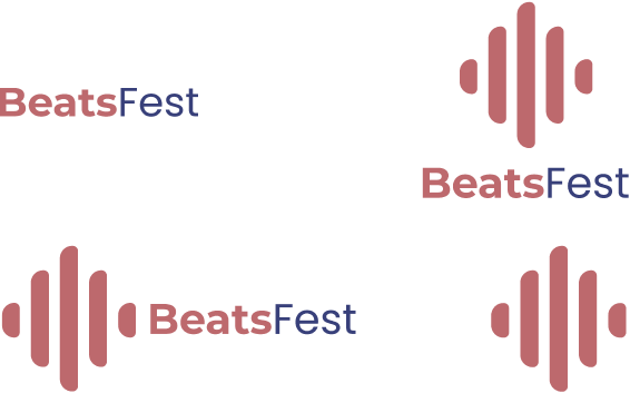
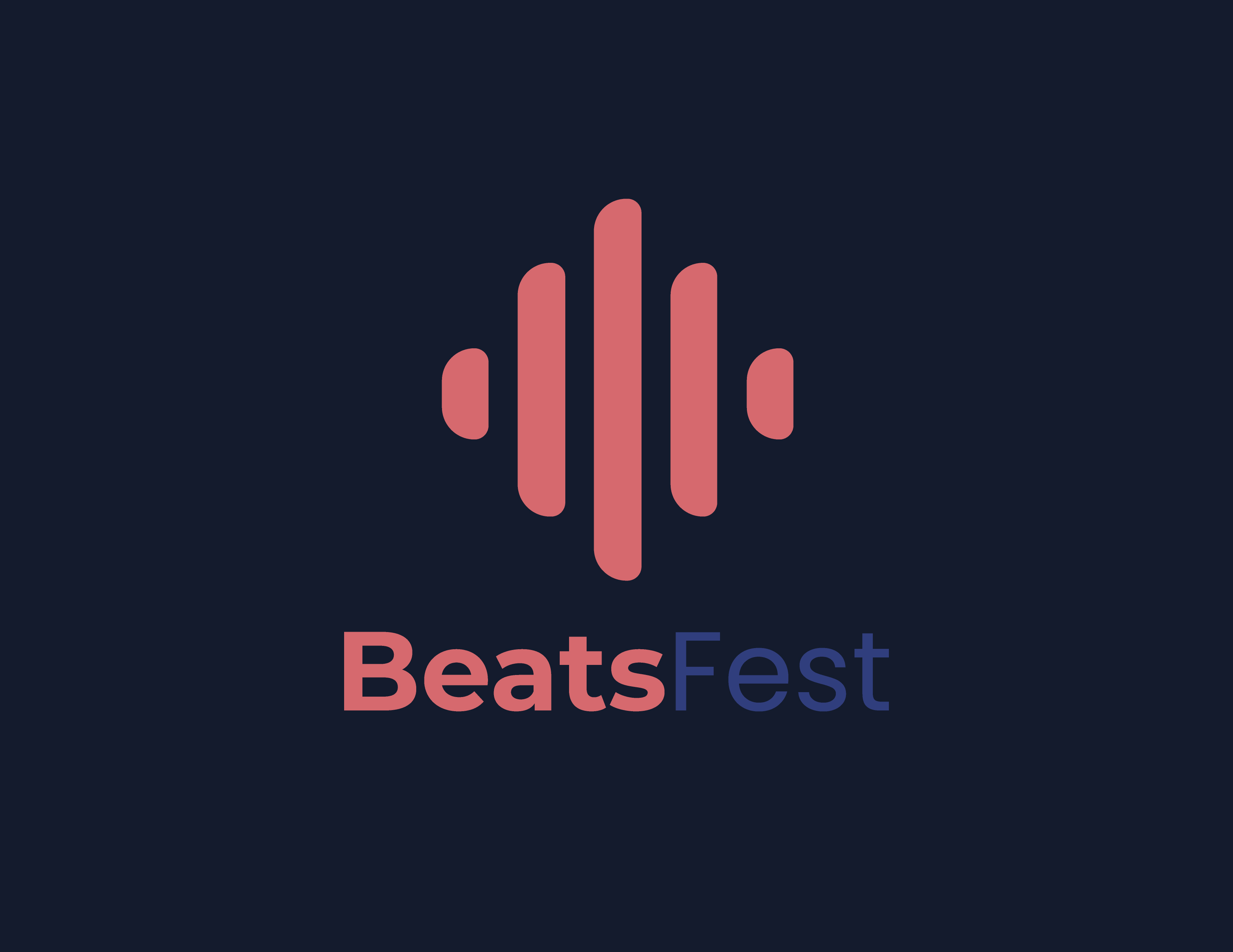
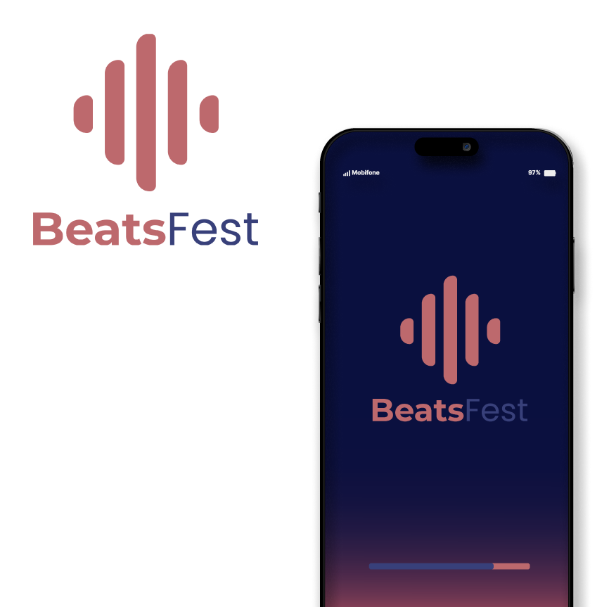
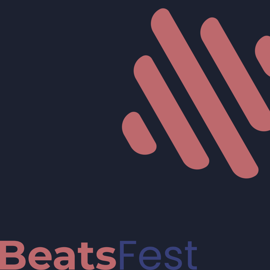
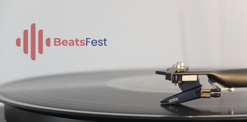
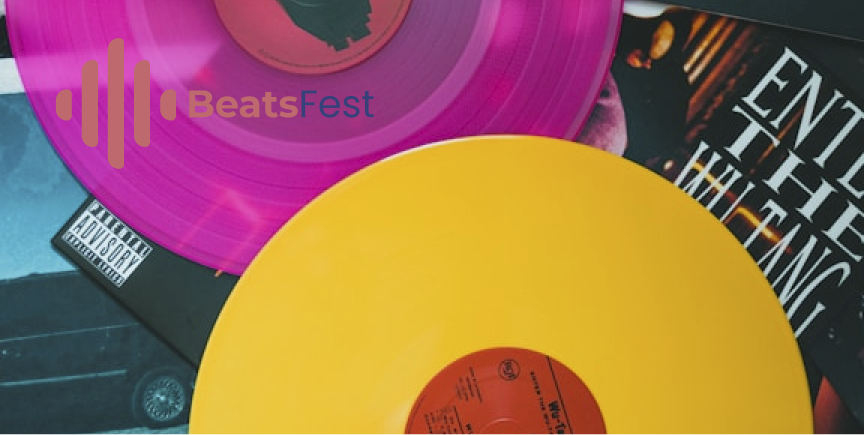
The BeatsFest logo uses soundwave-inspired shapes to connect the identity back to music right away. I created multiple logo versions so the brand could stay flexible across dark backgrounds, light backgrounds, print layouts, and digital screens.
Colors
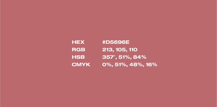
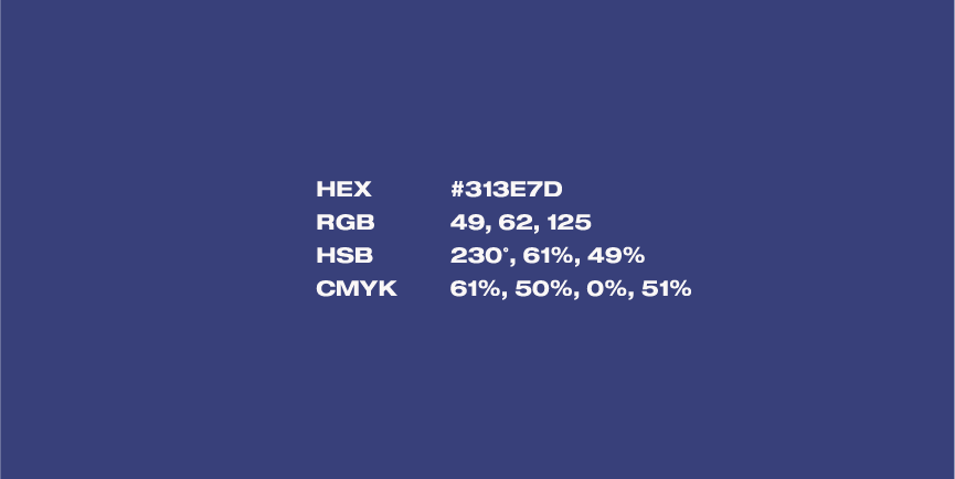
The color system pairs a muted indigo blue with a warm coral red. The blue gives BeatsFest a clean and modern digital feel, while the coral adds energy, warmth, and rhythm. Together, they create a brand palette that feels bold without becoming too loud.
Typography
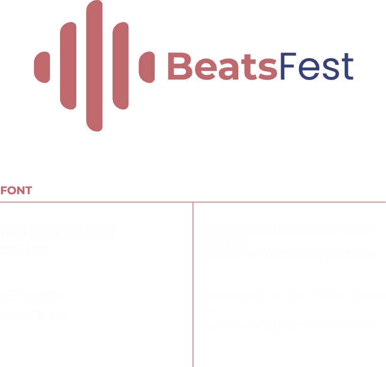
Montserrat Bold was used for strong brand moments and headlines, while Poppins Regular helped keep supporting text clean and readable. Together, the type system gives BeatsFest a modern look without making it feel too corporate.
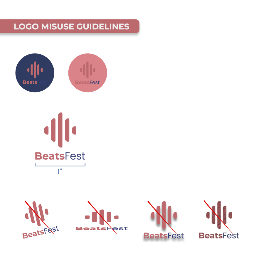
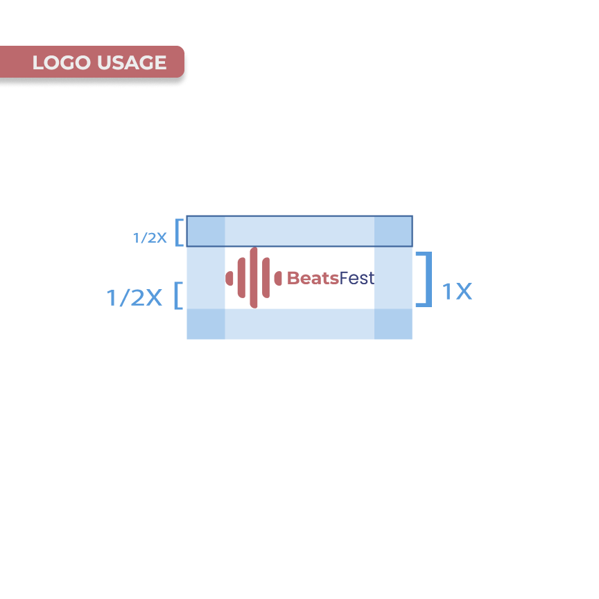
I also created logo usage rules to protect the brand identity. These guidelines covered spacing, minimum sizing, contrast, and common mistakes like stretching, distorting, or placing the logo on backgrounds where it loses readability.
Effective vs. Ineffective Logo Placement
Application Mockups
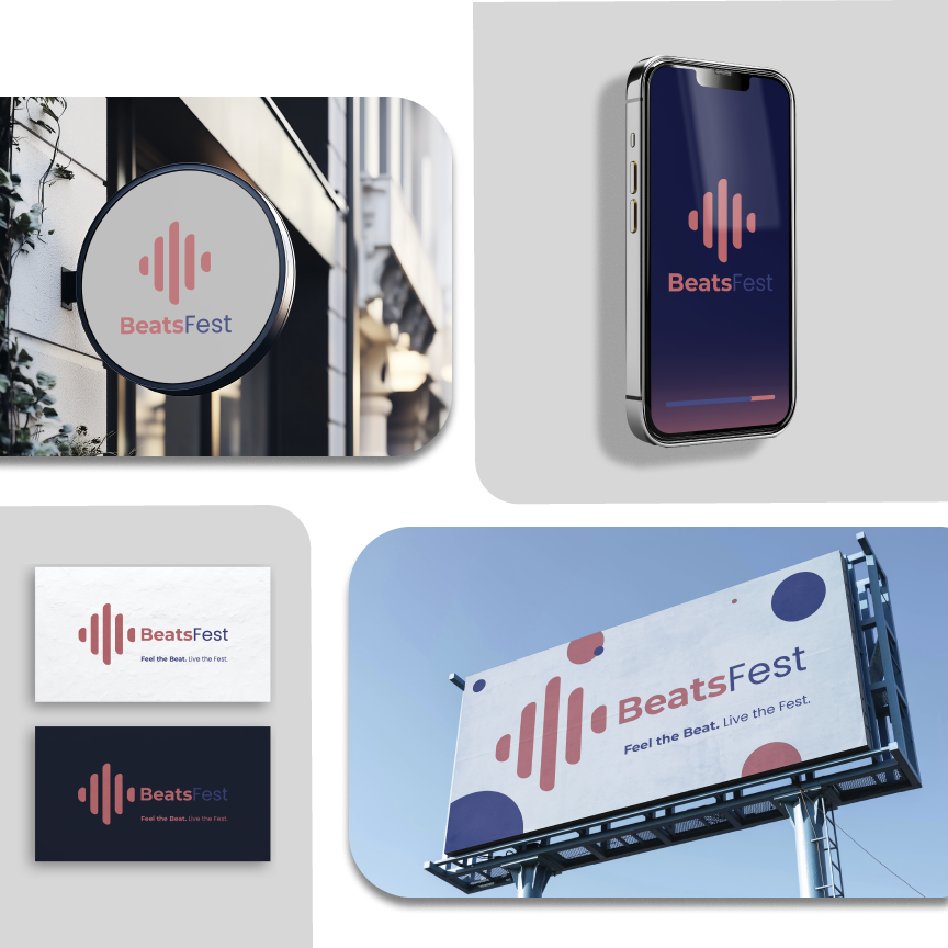
The mockups helped bring the brand into the real world. I wanted BeatsFest to feel like something that could live on a phone screen, a storefront sign, a business card, or a billboard without losing its personality.
This project helped me understand that a brand identity is more than a logo. It has to work as a system. Every color, font, layout choice, and logo rule needs to support the same visual voice so the brand feels consistent wherever people see it.
MODERN SOUND. BOLD IDENTITY. CONNECTING FANS AND ARTISTS THROUGH MUSIC.
Brand Identity, Logo Design, Typography, Color Palette, Brand Guidelines, Visual Design, Mockups Testimonial Content This project gave me a chance to build a full brand system instead of just designing one logo and stopping there. I focused on how the brand would look, sound, and stay consistent across different materials. It pushed me to think more like a brand designer, especially when creating logo rules, choosing colors, and building mockups that made the identity feel more real.